

website and app development.
- lpilla

- Mar 22, 2019
- 4 min read
My app/website would focus on areas in Peckham. More specifically events or places one could go.


I looked at many texts to try and gain inspiration.
I wanted to show off Peckham's character in my typeface.
I started to merge fonts I felt embody Peckham.
Fonts that had a quirk to them, that were thick and bold to give the feeling of proudness and reflect the graffiti, the grittiness of the area.


My first iterations, looked like fonts you could use on halloween, which was not my intention nor did I want people to look at it and think halloween. So I changed the pointy edges of the letters. This led to the first three letters having way more characters than the last three. If I changed the first three letters, then the whole idea of having my typeface, have a refection of Peckham's character would go out the window.

Why red?
Red represents love and danger in one. This does represent Peckham, with its violent past yet underneath that there is a loving community.
Red is also a primary colour and stands out to the eye.
Shapes?
Peckham is a cultural place, with many African and Caribbean influences.

I took the image of the photo above.
You are able to see vibrant colours and shapes, all working together to create a pattern.
I wanted to incorporate some of the art from the area, so why not the shapes


My initial designs.


I used the brush tool in Illustrator to create some graffiti vector art.
I realised that what I had created, resembled a sketchbook drawings or a girls notebook, as I used hearts and words such as "strong" and "together". This is not what i want my audience to think when when use my site or app, so I got rid of the hearts .
The use of overlaying things, is something I wanted to experiment with.


These images inspired me.
The roughness and overlaying of peoples words and the plants in the space.
There was lot of graffiti in Peckham, and I wanted to have some feeling of texture into my app to represent that part of Peckham.
The bold colours give a sense of power.


At this point, I was reflecting on what I had created.
The concept was there, but I did not feel as if, the apps function was working.
How the user would interact with my app, was bugging me as what I had created did not suit the needs.
So I went back to the drawing board to try and organise my thoughts and ideas.

I had the name "Peckham places" as my app's name. However my concept of showing the user what is happing in Peckham was broad, as places such as the CFL'arts center and Peckham levels had a range of thing going on, which is great , but in one of my feedback sessions i was told to narrow down my concept or els I would be too lost.
I started thinking about Peckham and how it has changed. My generation has seen Peckham go from a "Bad area" to a place where you see drunk people roaming the street at night.
The night scene has changed and there are now quite a few places you could spend your evening in Peckham.
This is when I chose to highlight Peckham's nightlife as my key idea of places I wanted to show people.
I started thinking of icons I could use to show what they could find out on my app.


I looked at a thesaurus for some inspiration, for the app's name.
I settled with twilight as it is moment of mystical energy or another dimension. and who wouldn't want to go on a magical night?
I began creating the word in the same font I had created.
The letter E doesnt sit too well with me. It looks like an arrow and its movement stands out.
I've changed the weight of letter and it still does not look right.


I wanted to create an icon for the section that would show what there is to do.
As it is evenings, I wanted something to reflect the night and party scene.
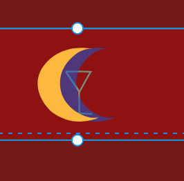
Twilight represents a time between, so I thought of a moon, the night and day.
half a moon can make one think of the night. I added a star to give it some scenery, but it looked like a flag to me, so I wanted to change it.
I wanted to add an element that suggested party. Drinks!
I drew a martini silhouette to suggest this idea.
Adding a shadow to the half moon gave it more character and allow it, to come out from the background.
People might want to see if something is happing the next day or within the week, so creating an icon to represent a week is my next step. My first thought was a calendar so I tried to make a simple table with squares to be a calendar, but it looked too 2D and it did not look right. I used the brush tool to create a calendar in a sketch style. You are able to read out "week" on the illustration. This allows the user to have an idea of the icons function.


I had to change my initials boards to fit my new concepts.


Here are the two icons I made for my app.


I wanted to visually show my places to my user, so vectorised their logos.


Most of my designs I created in illustrator and then brought it into XD.
As great as Xd is, it does have its limitations, such as no videos or gifs
My app does show the user, where they could go for a night out, and what is happing that week.
I could add a save function, where the user could save an event they want to go to.
The colour palette is heavily red.
Testing.
Viewing my app/ website with the play button, helped me see what size my desgings and text should be.
it also allowed me to see if something was out of place or needed change.
I fixed the lower bar with my navigation icons. I did this so the user can go back and forth as they please.
I fixed the moon icon on my website so the user does not need to go all the way to the top of the page to go back to the previous webpage.


Prototype links
link for app
https://xd.adobe.com/view/53311f44-03e7-45c7-514e-ec6ab2d40533-2500/
link for website
https://xd.adobe.com/view/6737584a-a0d4-46bf-512c-25d56a5763fb-1106/


Comments